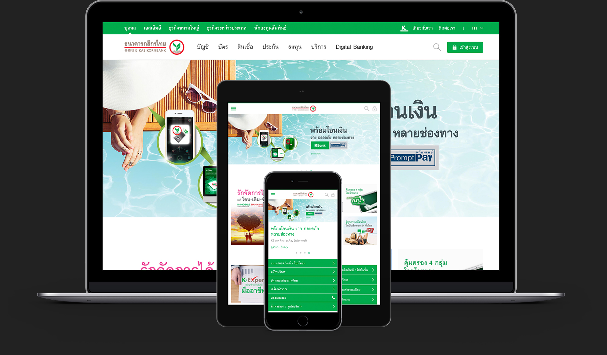
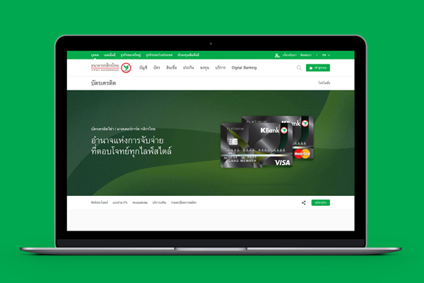
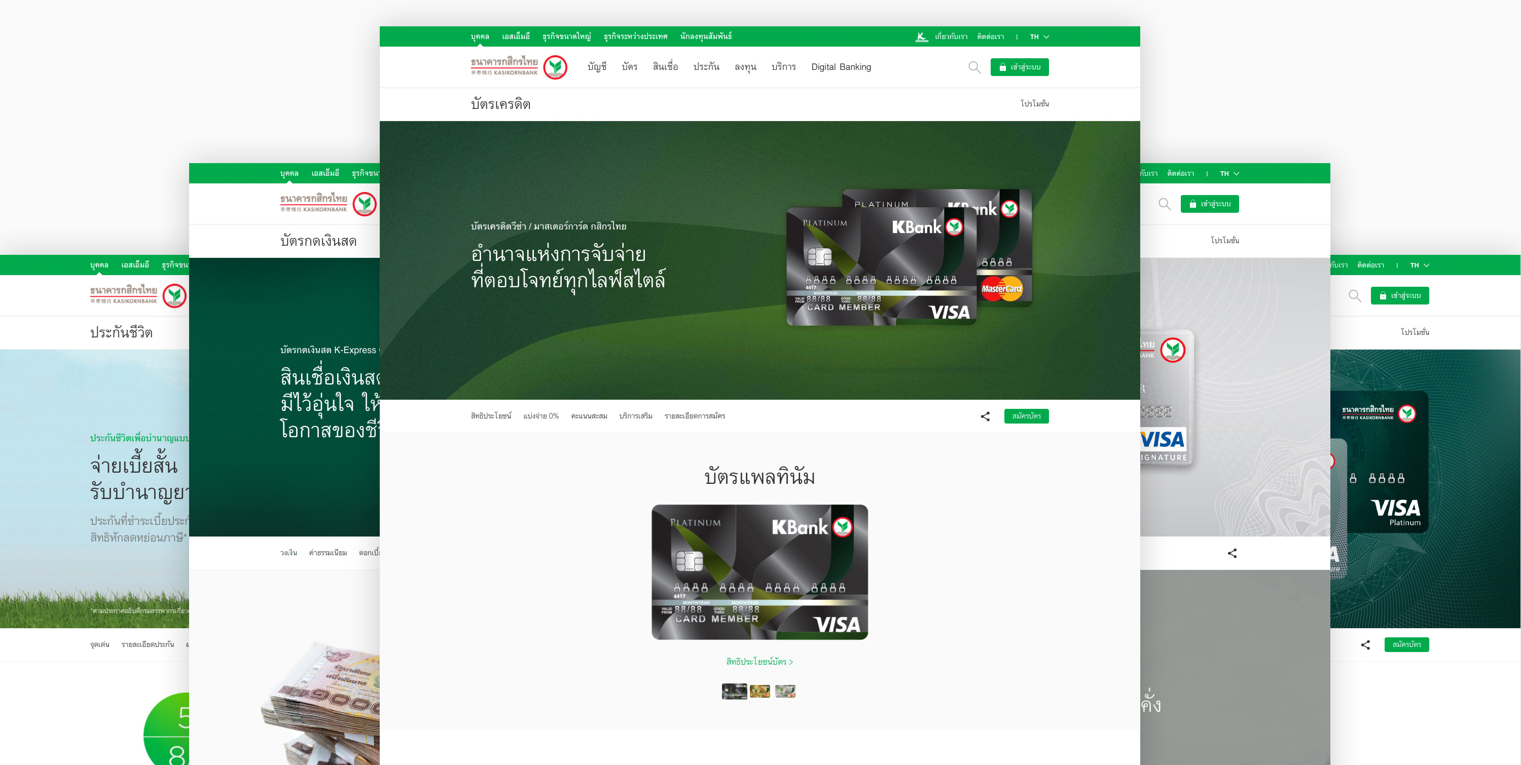
Kasikorn Bank is Thailand's leading bank offering a wide range of banking products & services to customer from all walks of life. It is also known as the leader in digital banking operating "Towards Service Excellence”.
Launch:11 February 2017
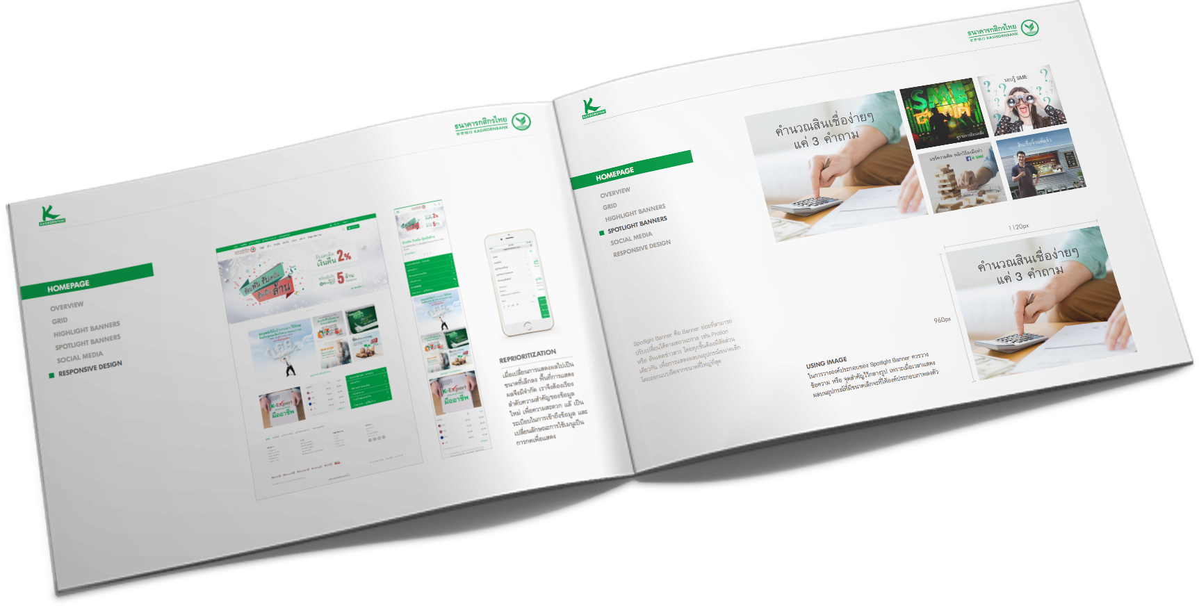
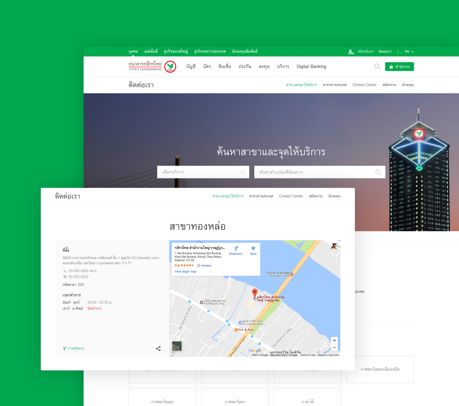
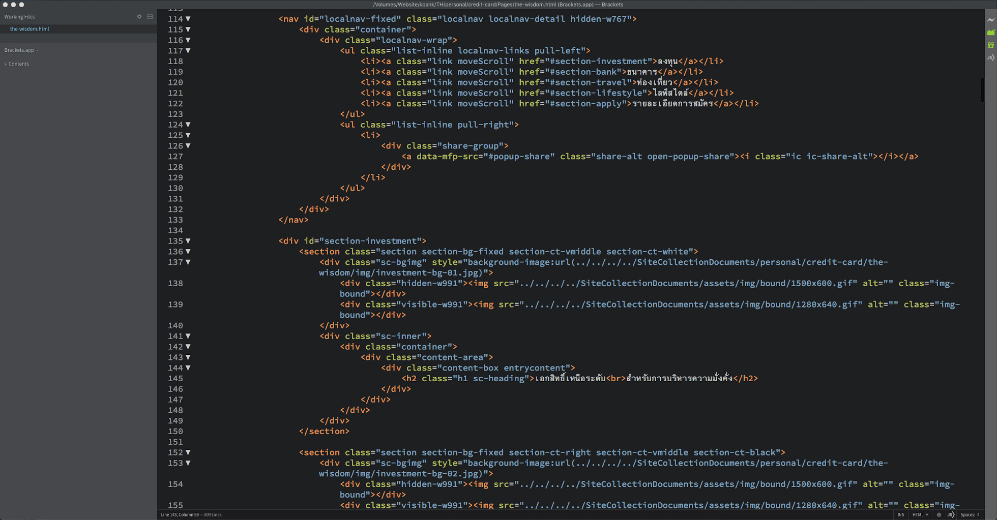
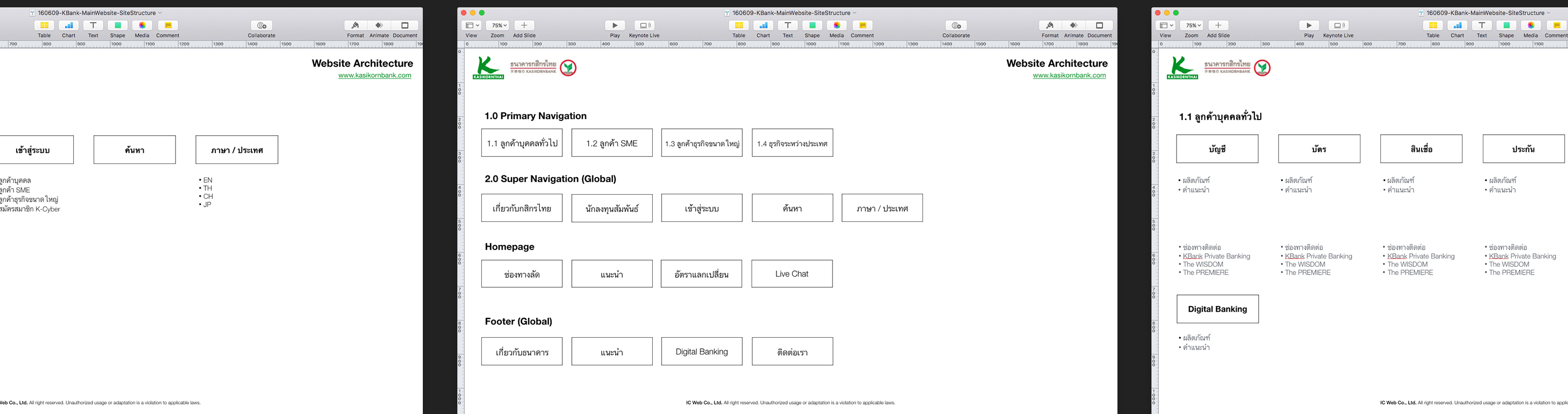
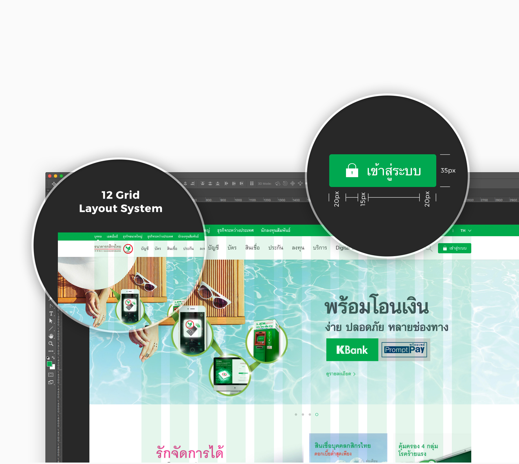
#SiteArchitecture #ContentDevelopment #UX #UI #Wireframe #Design #Responsive #CIGuideline


